Blue Plate Network
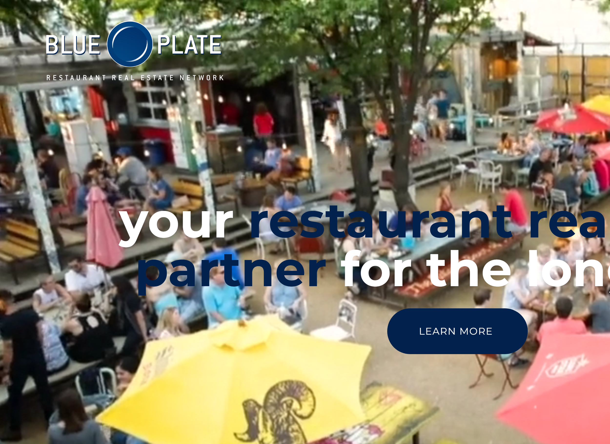
“Your restaurant real estate partner for the long haul.” Blue Plate Network places some of the most exciting restaurants in Dallas. But their brand wasn’t telling that story.
Carter Wilson built Blue Plate around a long-haul partner philosophy, pairing restaurateurs with the right communities for sustainable growth. The work demanded a brand with the same caliber as the spaces it brokers.
We rebuilt the identity from typography to color system, redesigned the website around visual storytelling of every venue, refreshed print collateral, and packaged a marketing toolkit Carter’s team could deploy without us in the room.
The result is a brand that feels as premium as the restaurants it represents, with measurable lift in inquiries and engagement.
Match a concept to a space. See the deal we’d pitch.
Pick a restaurant concept and a target footprint. Watch the Dallas neighborhood, site type, and a Blue Plate broker pitch surface in real time. The long-haul value prop, made visible.
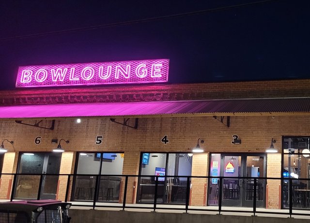
Trinity Groves
Trinity Groves Anchor Bay · Fast Casual Concept
Pre-built infrastructure cuts buildout 60+ days. Foot-traffic shared with neighboring concepts. Strong tenant cluster for an emerging operator.
Identity Built for the Long Haul.
Refined typography, a navy and gold palette, and a voice that signals the caliber of restaurants Blue Plate places. Every touchpoint reads long-haul partner, not transactional broker.
“Your restaurant real estate partner
for the long haul.”
Calm, confident, partnership-first. Avoids hard sell. Talks about communities, caliber, and the people behind the restaurants.
From positioning to proof of caliber.
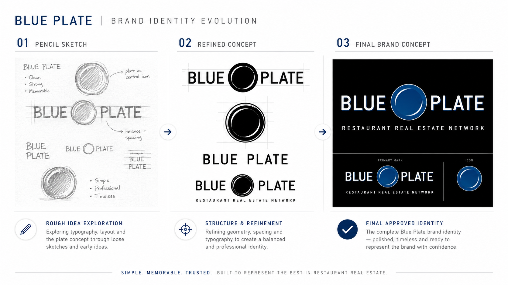
The work begins with the identity evolution (sketch → refined concept → approved system), then moves into the digital front door and the restaurant portfolio it supports.